I’ve been dumping my PitchLogic data into spreadsheets and manipulating it in HCL Notes databases, but I wanted to see some ‘visualizations’ to evaluate the data a little better. A picture is worth a thousand words, right? Or it “a pitcher is worth a thousand words”?
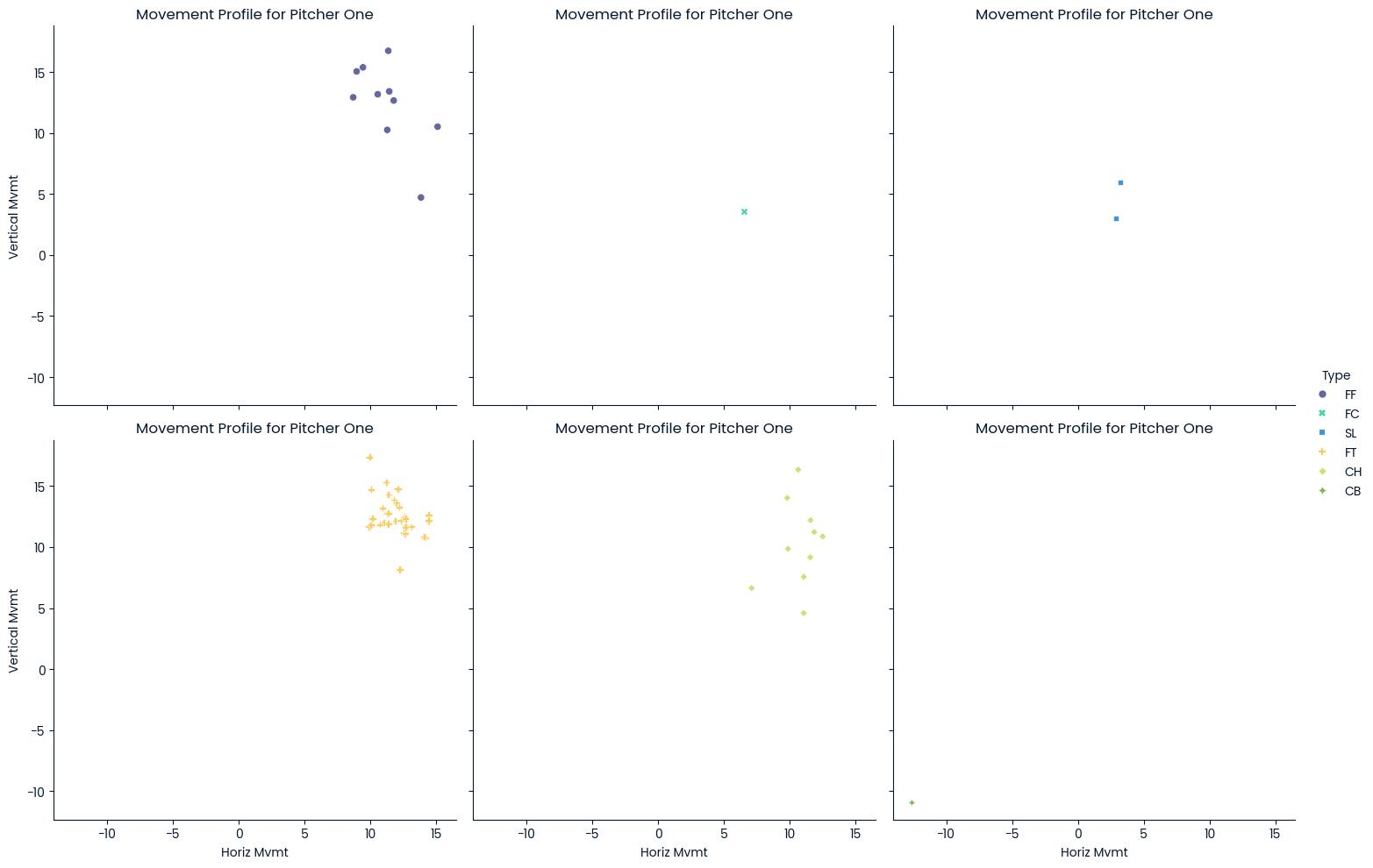
Within the PitchLogic app, you can get the vertical and horizontal movement for a single session. When you go look at your session reports, you see a little more. So, I’d used ChatGPT to help me create some visualizations from my downloaded data. Here’s a sample, showing those movement profiles by pitch type. This is only from about 50 pitches, so it looks interesting, but is a little less-than-actionable.
As you know from Coaching 203: Bullpen Pitch-Tracking Sheet, I’m collecting location data on my bullpen tracking sheets, so I decided to create some charts and graphs using that.

Now, that gives a very good visual impression of where the pitches are going. Fortunately for us, this is our hardest throwing pitcher and we’re going to have him for two more years. One of the things that pops out about this is that he’s missing high (1-2-3) more than he’s missing low (7-8-9) with 34% of his pitches being high and just 6% being low. Oddly, in this sample, nothing inside or outside at strike zone height. That could be just because it’s a small sample or might point out bad data collection (we might be categorizing those inside and outside pitches as high or low as well.)
The good thing is that I can also break this down into different pies for each pitch type, but the lack of data doesn’t make that real useful right now. When you have it, it can really bring home what the quality of the pitches really is.

I learned something new as well. I might have seen a boxplot a few times, but I never understood them. This uses statistical methods to place the velocity of the various pitches he’s thrown. Now, you must keep in mind that these are to auto-tagged pitch types. For any of you who are coaching young teens, you’re going to notice that how the PitchLogic ball tags the pitches is not always what the player intended to throw.
I’ve been telling other coaches that one of the things we need to work on with youth players is “grip discipline”. Most of them grow up with no instruction in how to grip the ball at all. Sometimes, they get instruction in how their fingers ought to be aligned, but rarely do they get instruction in how to line up the laces and their fingers the same every time. When I first started coaching Little League, I sent a Dad out to the mound to talk to our pitcher. He came back and said, “He was holding the ball with three fingers!” That was when I first realized that a lot of Dads and assistant coaches also need coaching and instruction.
Technology, and the PitchLogic ball in particular, give us a lot of numbers. As any old baseball guy will tell you, the only number that actually matters is balls and strikes. I don’t focus on how to improve those myriad numbers, like a player’s spin rate or velocity. The goal is consistency since moving the ball in a consistent way makes it easier to throw strikes. So, we look at how consistent is the arm slot, or whether the release makes it a cutter instead of a fastball. Then, we use the numbers as a gauge for ‘how consistent’ the pitches are.
How can you do this?

If you have a PitchLogic ball, you can get your data. Just go to the “hamburger” down in the lower left in portrait mode or upper right in landscape mode and then click on “Get CSV Data”. This will let you pick the dates for which you want data and then email you a file. You can drop it into ChatGPT and start asking it to make you some visualizations.
I plan on writing about the technical details on my software development blog, so for those who love that stuff, revisit here in a few days for a link!
